EdTech Platform Redesign
Led the redesign of an award-winning German EdTech platform, improving usability, readability, and conversion across a content-heavy experience. Transformed a fragmented, ad-heavy interface into a structured and user-friendly learning platform. Reduced bounce rate by 30% and increased conversion rate by 15% through data-driven UX improvements.
Problem
Despite having 1M+ users, the platform suffered from:
- high bounce rate within the first few minutes
- poor readability of complex math content
- excessive ads and intrusive popups
- difficult navigation and content discovery
👉 Users were leaving quickly due to a friction-heavy experience
Key Insight
Research showed:
- The issue wasn’t the content → it was presentation and clarity
- Ads and popups disrupted focus and reduced trust
- Students needed a clean, distraction-free reading experience
- Some users were willing to pay for ad-free learning
👉 The real problem was experience design, not content quality
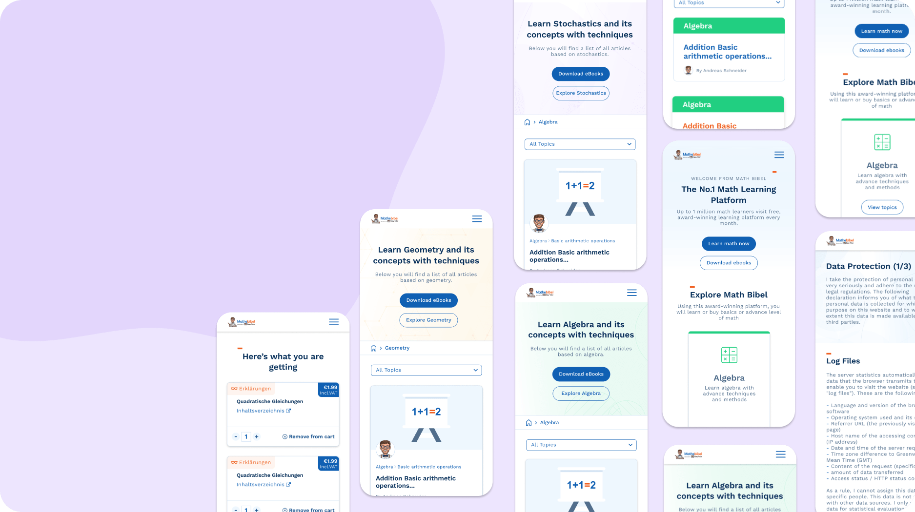
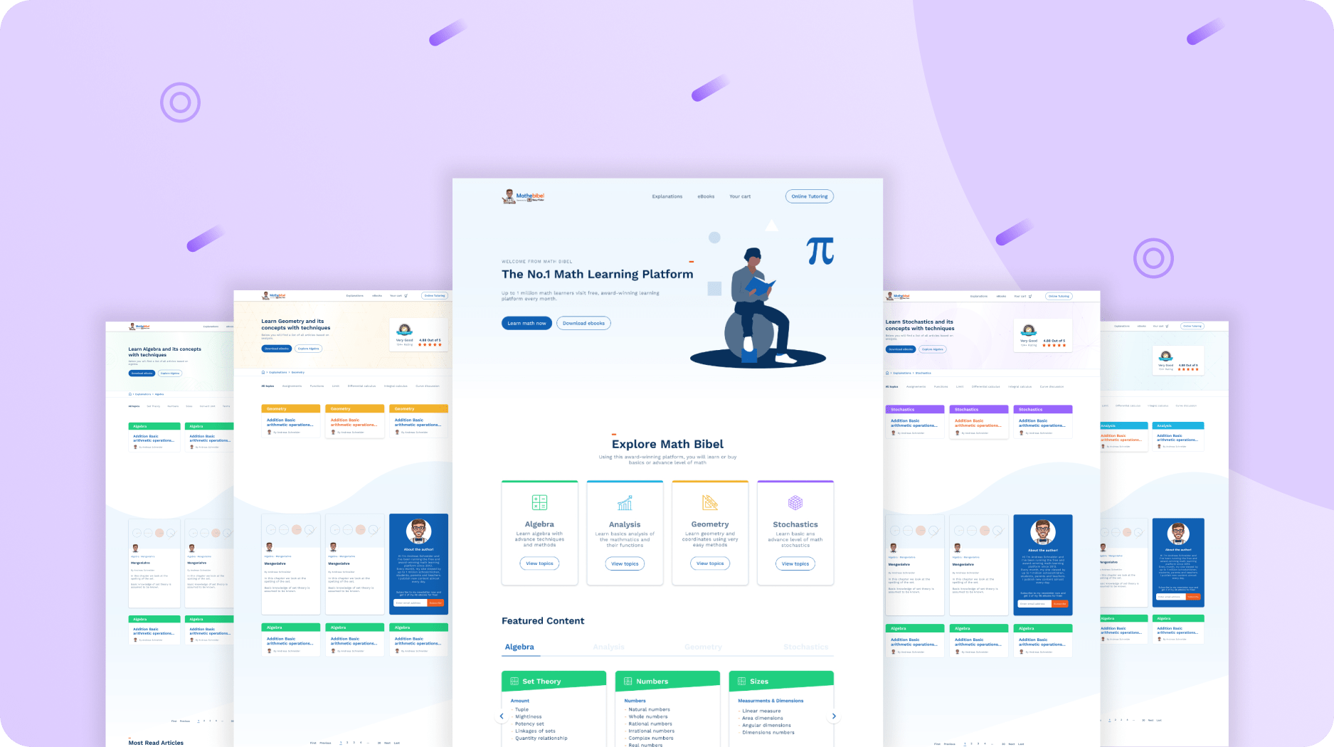
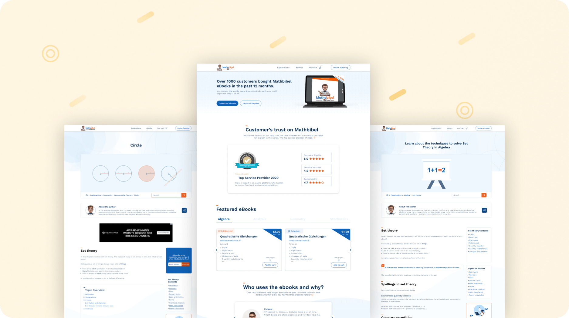
Solution
- Redesigned the platform with a readability-first UI, optimized for learning
- Reduced intrusive ads and removed unnecessary popups
- Re-structured content into clear categories and simplified navigation
- Introduced PDF-based learning (ebooks) for ad-free experience and monetization
- Improved presentation of complex math topics using better hierarchy and visuals
- Delivered responsive designs and collaborated closely with developers
Impact
- Reduced bounce rate by 30%
- Increased conversion rate by 15%
- Achieved 90% positive feedback on usability
- Improved engagement through a cleaner, distraction-free experience
No items found.
Next Project
Does your product feel messy or hard to use?
When dashboards feel confusing and workflows take too many steps, users lose trust fast.
I help you redesign your SaaS product, improve usability, and create clear, developer-ready experiences.